Image: James Oladujoye / Pixabay
[mepr-hide if=”rule: 12095″] This post contains members-only content, please log in below or join today to view it.[/mepr-hide]
[mepr-show if=”rule: 12095″]This question about the smallest font size for slides was originally sent to Guild Director Geetesh Bajaj as an answer request on Quora, and he expands on his answer below.
Most designers love using white space as a design element on slides, but clients often override this with demands to include more content. What about aesthetics and focus? Overloading text and/or images negates the very idea of well-designed slides–it’s a compromise that should be avoided.
In the real world, however, there will be occasions to cram this content in, and the immediate result is that you need a font size smaller than what you started with. Really, what is the smallest font size that you can use?
There is no definite answer to this question, and as a rule of the thumb, you will want the minimum font size to be 24 points.
However, by declaring 24 points as the minimum font size, I may have opened a can of worms. There are so many other factors in play here that I cannot recommend any rules, but here are some guidelines:
- Start with the largest font size. Let’s start with the largest point size — this can be 44 points for slide titles. Most PowerPoint templates built within the program use the largest point size as anywhere between 36 and 54, but don’t believe that PowerPoint templates that Microsoft built inside the program are set in stone, though 44 pt is a good rule of the thumb for slide titles.
- Explore largest non-title text size. I would then look at the largest text size for the rest of the slide, such as body text. Around 32 points (anything between 28 to 36 points) is a good size.
- Now decide the smallest font size. For sub-bullets or text in the lower hierarchy, you can go down two levels and make them 28 and 24 point size respectively. This is exactly how I arrived at the minimum font size suggested at the beginning of this post.
- Go with smaller font sizes for unimportant stuff. But what about disclaimers, warnings, etc. added because your legal team asks you to do so? Something as low as 8 to 10 points will do. If your audience has to squint to read it, you might as well make sure they can’t read them at all! After all, no one needs to read that stuff.
- Not all fonts are the same. Do remember that these point size recommendations are faulted! Why? That’s because 24 point Arial is much larger than 24 point Times New Roman or even Calibri. (Remember, these are guidelines and not rules!)
- Make exceptions. Yes, you can go down a wee bit lower than 24, if needed. But limit these changes for a few slides, and only when absolutely essential. Remember that the slides were created for the audience. The audience was not created for the slides. Make sure that the farthest person in the back of the room can read your slides.
- Use less text. It is amazing how this guideline automatically lets you use larger point size because you don’t have too much text to cram on a slide anymore!
- Use more pictures. That will again help you create slides with larger and lesser text.
- The text exists beyond text boxes. Remember that text size is not limited to the text in boxes and placeholders. Text size is also important in charts, SmartArt, tables, etc. Most companies use tiny text in these slide objects. At times, this will need a company-wide overhaul in design ethics. Maybe it’s time you made a start in the right direction.
- Learn to break the rules. Follow these guidelines, but know that there will occasions to disregard them too. Maintain a philosophical attitude and try your best.
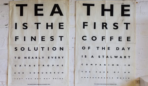
Visit an ophthalmologist lately? You may have seen a chart (as shown above) where the text diminishes in size. Treat your audience as someone who is visiting an ophthalmologist — BUT — do not show them the smallest font size they cannot read. In other words, make sure that every person in your audience can read all the text which you want them to read. Eliminate those impossible-to-read lines. [/mepr-show]

Geetesh Bajaj is an internationally acclaimed PowerPoint, storyboarding, info-diagramming and presenting expert who has been awarded the Microsoft PowerPoint MVP (Most Valuable Professional) every single year for 18 years now. He is also on the Board of Directors for the Presentation Guild, a presentation industry trade association, based out of Cincinnati, USA.
Based out of Hyderabad, India, he believes that any presentation is a sum of its elements—these include abstract elements like story, concept, color, interactivity, and navigation—and also slide elements like shapes, graphics, charts, text, sound, video, and animation. Geetesh has authored six books.
