by Stephy Hogan | Inspired by Design, Member Webinar, Webinar
Continuing the series on PowerPoint theme colors, Julie demonstrates how accent colors influence all types of content created with a template. Learn how to choose accent colors that work well together and work well for your presentations.

by Stephy Hogan | Inspired by Design, Member Webinar, Webinar
First part of a series on understanding and choosing PowerPoint theme colors. In this episode, Julie explains light and dark colors as part of a PowerPoint color theme and demonstrates how these colors work in conjunction with Background Styles to ensure text is properly contrasted on your slides.

by Stephy Hogan | Inspired by Design, Member Webinar, Webinar
Without structure, you have chaos. Learn how to use foundational design grid to help establish consistency and to create more aesthetically pleasing slide arrangements.

by Stephy Hogan | Inspired by Design, Member Webinar, Webinar
This episode covers how to effectively use icons to convey an idea. Julie shares resources for icons, discusses pairing them with a label for clarity, and demonstrates using the same icon style for consistency throughout a presentation.

by Stephy Hogan | Member Webinar, Webinar
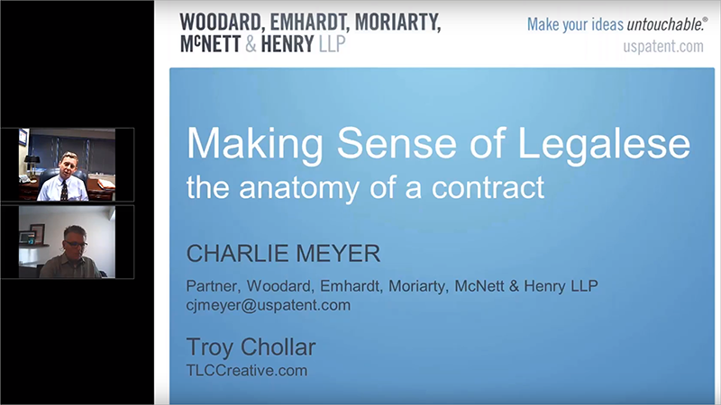
Charlie Meyer shares his knowledge of the legal landscape as it relates to independent graphic designers looking for contracts for their projects.

by Stephy Hogan | Inspired by Design, Member Webinar, Webinar
Julie shares best practices for choosing fonts based on your presentation sharing scenario. She points out a few things to watch for when selecting fonts and things to consider when making choices for your templates and presentations. Note: watch Episodes 20 and 22 for updated information on fonts for PowerPoint.

