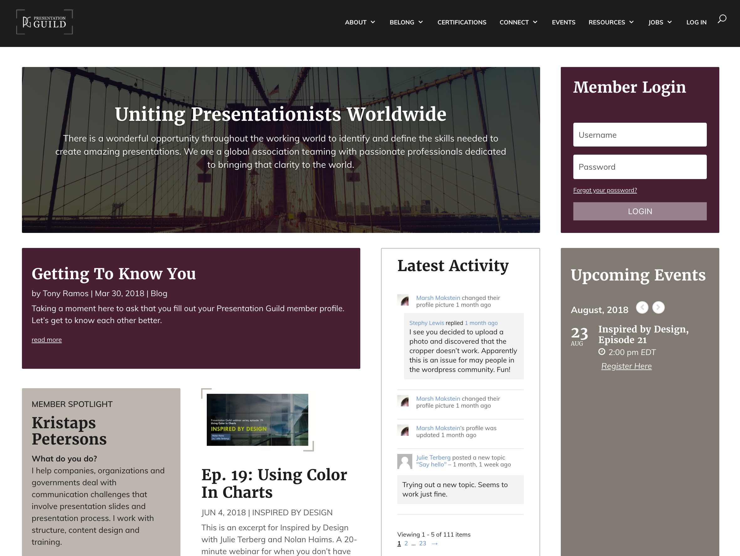
Coming soon, our redesigned website will save you time and effort every time you visit. Less digging, more finding, improved engagement with others. How? Read on…
It’s been almost two years since we officially launched to the public. The original Guild website was a labor of love, glitches, fixes, and expansion. For the last 10 months, the Guild’s faithful webmistress has been hard at work building a whole new Guild experience. Teamed up with the art director, Julie Terberg, they are almost ready to reveal it to the world.
We know you’ve been antsy. We know the current experience has its flaws. You’ve given us great feedback which we have incorporated into the new and improved Guild site which is due to launch in the fall of 2018.
Less selling, more info you want.
When you first come to the main page, you will no longer be shouted at to JOIN NOW! Instead, if you’re logged out, you will be presented with a selection of content. These are intended to give members a very quick glance of what’s new while teasing non-members with just enough information so that they might want to dig deeper.

Better Navigation
Great navigation is the foundation of any good user experience, so we’ve paid special attention on our site navigation and structure. Whether you’re logged in or not, you will see all available places to go in the updated navigation configuration (with the exception of “my Guild” which goes to your personalized account information).

Let’s go through a quick breakdown of each submenu:
In the About section, you can learn about the people behind the scenes, our sponsors, and reach out to us. You will also find a quick FAQ when you choose “contact us.”

Under Belong, you find everything you need to know about joining, sponsoring, or otherwise helping the Guild.

Under Connect, you will notice a few new things. In the new Guild experience, there will be a live Guild chat room and the Guild activity stream so you can see what other members have been up to (such as adding to their portfolios, new forum posts, etc.). There will be a page dedicated to our book club, as well.

Looking for anything related to help you in your presentation life? Here they are in the Resources section, including courses, presentation industry standards, salary survey, the blog, and our webinar archives.

The last thing I will highlight about the structure of the site is My Guild. Previously, this was just one link in the main navigation and you were left to hope that left-hand sub menu was where you needed it when you needed it. All of that information is now incorporated into the main navigation. There are many new things in this menu that I think you will all appreciate, but I won’t get into them in this post. My Guild deserves an article of its own.

More Mobile Friendly
One of the biggest frustrations is how the original site is, well, almost mobile friendly. The new Guild experience has been tested extensively on mobile and is much easier to use. Those of us with big fingers should have an easier time of things.
More to come…
This is only the first of the teasers. I hope that you saw some things above that have you excited for more. Keep watch for more previews of the upcoming website transformations, new benefits, and generally awesome features!
Sincerely,
Your Webmistress

