Contest 002 is now ready for its close-up!
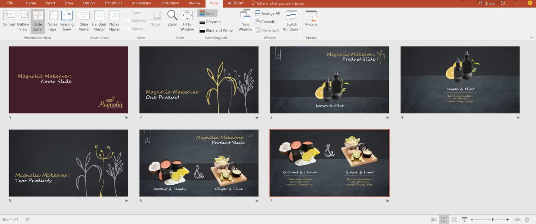
Our second design contest, “Makeover Makeover”, challenged you to create a presentation template for Magnolia, our fictional makeup and skincare client. Kimber from Magnolia wanted a vintage feel but with modern styling, and needed lots of space on the slides to feature the all-natural packaging of her beauty products. Main colors are merlot, gold, and slate gray (she really likes chalkboard texture).
Our winner is Presented. No, really. Presented, formerly named Cornerstone Presentations, is a presentation design company in the United Kingdom. Formed in 2009, the company includes senior designer Marc Richard, who submitted the winning entry.

As you can see, the work meets Kimber’s requirements with style and finesse. We especially enjoy the handmade feel of the typography. It suits the chalkboard background perfectly. Ample space for product imagery is evident throughout. Aspect ratio should be noted here, too. Especially in retail and face-to-face settings today, a widescreen 16:9 format is now the rule rather than the exception, no?
A big, wine-colored, lipsticky kiss to everyone at Presented for this excellent work!
Winner of Contest 002: Makeover Makeover
Author: Stephy Hogan
Author: Stephy Hogan
Winner of Contest 002: Makeover Makeover
We’re very excited to learn from you! If you work in any aspect of the presentation industry, have a pro tip or trick, lesson learned, or favorite resource to share, and would like to contribute to the Presentation Guild blog, please consider submitting an article for consideration on our blog post submission page.
